Membership build · Fitness club, Islamabad
A gym site with the intensity of the gym floor
U Fitness is positioned as Islamabad's highest gym, offering strength and conditioning facilities with professional coaching. Gym membership is an emotional purchase made on a rational pretext: people join because of how they want to feel, then justify it with equipment and trainers.
The situation at the start
Intensity has to be felt before it is read.
A prospective member decides how they feel about a gym in the first second, from the photography and the visual register alone. A calm, airy, minimal layout signals a boutique studio; that is a completely different product from a serious strength and conditioning floor, and it attracts a different member.
The rational layer still matters, but it arrives second. Equipment count, trainer credentials and existing membership are what convert the initial reaction into an enquiry.
Client-supplied facility figures, presented as given. Scope agreed at kickoff.
The approach
Four workstreams,
one engine.
Each stream existed to make the others measurable. Nothing here was run in isolation.
Match the room
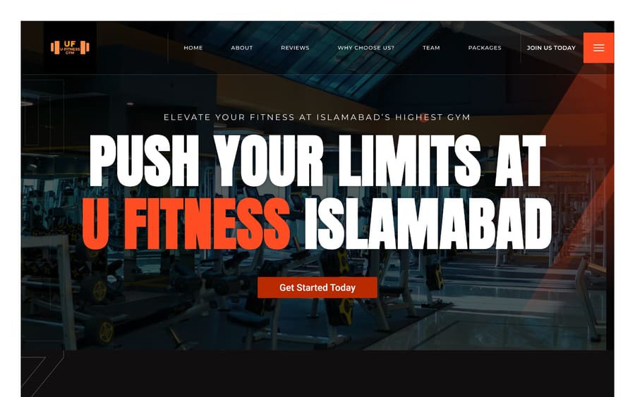
The design signals what kind of gym this is before a word is read.
- Dark ground with high-contrast display typography
- Training photography rather than empty-facility shots
- A single hot accent used for actions and emphasis
- Condensed, heavy type that reads as strength rather than wellness
The numbers that answer the doubt
Every figure addresses a specific hesitation about joining.
- 200+ equipment, answering whether the floor is properly stocked
- 10+ expert trainers, answering whether coaching is real
- 100+ members, providing social proof of an active community
- Positioning stated plainly at the top of the page
One obvious next step
Fitness intent decays quickly, so the path has to be immediate.
- Get Started as the persistent primary action
- Membership and programme information reachable in one step
- Direct contact for people who want to ask before committing
- Facility and services presented without burying the signup
Heavy imagery, light pages
Photography carries this design, so it had to be engineered.
- Compressed, responsive imagery sized per device
- Mobile-first layout for the phone-first audience
- Accessible contrast maintained over photographic backgrounds
- HealthClub and Organisation structured data
The results
A site that feels like the floor it is selling.
The delivered site commits to a high-contrast, high-intensity visual register: dark ground, condensed display typography, training photography and a single hot accent reserved for actions. That combination tells a prospective member what kind of gym this is before they read anything.
Immediately beneath, the rational case is made in counts rather than adjectives — 200+ equipment, 10+ expert trainers, 100+ members — each answering a specific hesitation about whether the facility, the coaching and the community are real.
What shipped
Delivered scope- Templates
- Home, about, services, trainers, membership, contact
- Visual register
- Dark ground, condensed display type, single hot accent
- Proof surfaces
- Equipment, trainer and member counts on page
- Primary action
- Get started, persistent across the site
- Structured data
- HealthClub and Organisation
- Handover
- Programmes and trainers editable by the club
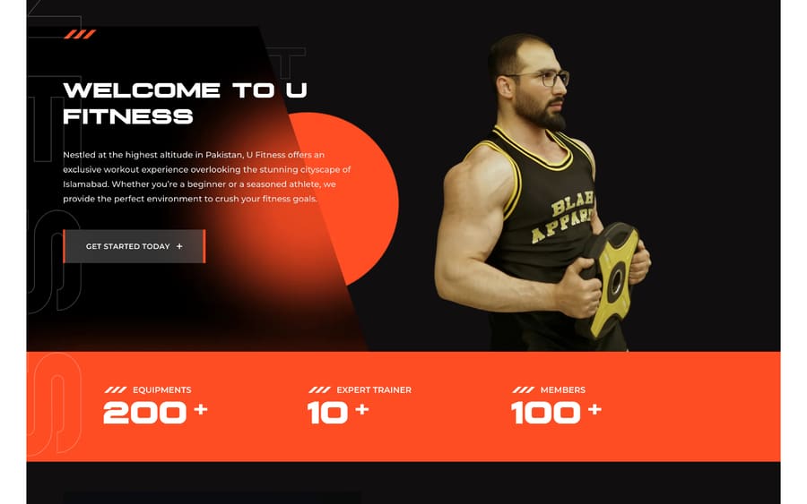
Facility figures (equipment, trainers, members) are supplied by the client and presented as given. This engagement was scoped as a website build; no traffic or membership figures are claimed.
Key takeaways
What made
the difference.
- 1The visual register is the positioning
A minimal layout and a heavy one sell to different members. Choosing deliberately is the strategy.
- 2Emotion first, justification second
People join on feeling and defend it with facts. The page has to deliver both, in that order.
- 3Counts beat claims
“Fully equipped” is unverifiable. “200+ equipment” is a fact a visitor can weigh.
- 4Photography-led designs must be engineered
The imagery that carries the design is also the thing most likely to make it slow.
Related work
More like this.
Other engagements that shared a discipline with U-Fitness Gym.
 Pakistan
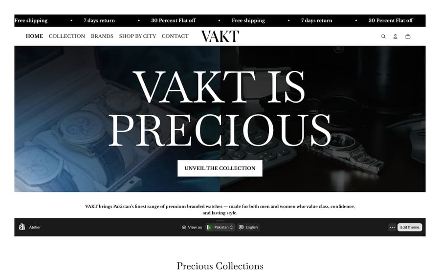 Website buildEcommerce buildVAKTAn editorial storefront for premium watches, where the product photography carries the page and the catalogue still stays shoppable.EditorialstorefrontMultibrand catalogueShopifycommerceRead the case study →
 Pakistan
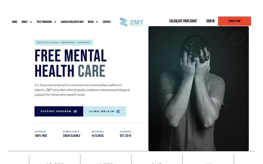 Website buildNonprofit buildZMT Primary Healthcare NetworkA healthcare nonprofit site built around two very different visitors: the patient who needs a clinic, and the donor who needs proof.14clinics mappedZakateligible flowDualaudience buildRead the case study →
Your turn to be the case study
Free audit. Straight answers. Twenty four hours.
Get Your Free Audit →