Ecommerce build · Luxury watch retail
A watch storefront that reads like a magazine
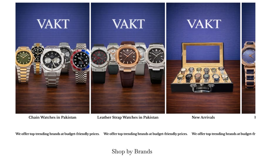
VAKT brings premium branded watches to Pakistan for men and women who value class, condition and lasting style. Selling watches online is a photography problem before it is a commerce problem: at this price point the customer is buying reassurance, and a grid of thumbnails on a white page does not provide it.
The situation at the start
A category where trust is the whole purchase.
A premium watch is an expensive, considered, easily-faked purchase. The buyer is not comparing feature lists, they are deciding whether to believe the seller. Everything on the page either builds that belief or quietly undermines it: the quality of the photography, the honesty of the condition notes, the clarity of returns and shipping.
The brief was to build a storefront that felt like a boutique rather than a marketplace listing, without losing the practical parts of ecommerce: filtering by brand, browsing by style, and getting to checkout without friction.
Scope agreed at project kickoff; delivered site verified at handover.
The approach
Four workstreams,
one engine.
Each stream existed to make the others measurable. Nothing here was run in isolation.
Let the product carry the page
The design gets out of the way so the watches do the selling.
- Full-bleed hero photography with restrained typographic overlay
- A serif display voice that signals boutique rather than bargain
- Deep, quiet backgrounds so metal and dial detail read clearly
- Generous whitespace between collections to slow the scroll down
Two ways to shop, not one
Watch buyers arrive either loyal to a brand or attached to a style.
- Shop by brand for buyers who already know what they want
- Collections by style — chain, leather strap, new arrivals
- Category pages that can each rank and convert on their own
- Related-product surfacing inside the same price band
Reassurance in the flow, not buried in a policy page
Every objection answered where it occurs.
- Free shipping, seven-day returns and flat-fee terms in the header strip
- Condition and authenticity language on the product template
- Checkout kept short, with no forced account creation
- Stock and availability surfaced before the customer commits
Fast on a mid-range phone
Most of this audience browses on mobile, often on mobile data.
- Image pipeline sized per device rather than one large asset
- Mobile-first layout, not a desktop layout squeezed down
- Product and Breadcrumb structured data across the catalogue
- Clean URL structure so collections stay linkable and rankable
The results
A storefront that behaves like a boutique.
The delivered site leads with photography and holds the catalogue behind two clear routes: shop by brand for the decided buyer, and collections by style for the browsing one. Each collection is its own indexable page rather than a filter state, so the catalogue can earn search visibility instead of hiding behind query strings.
The commercial reassurance a watch buyer needs — shipping terms, returns window, condition and authenticity — sits in the header strip and on the product template rather than in a policy page nobody opens.

What shipped
Delivered scope- Platform
- Shopify, custom theme
- Templates
- Home, collection, product, brand, cart and checkout
- Catalogue
- Organised by brand and by style, cross-linked
- Structured data
- Product, Breadcrumb and Organisation
- Performance
- Responsive image pipeline, mobile-first CSS
- Handover
- Editable collections and merchandising by the client
This engagement was scoped and delivered as a website build. No traffic, ranking or revenue figures are claimed for it, because no analytics baseline was part of the agreed scope.
Key takeaways
What made
the difference.
- 1At this price point, photography is the product page
Design restraint is not a style preference, it is what lets expensive objects look expensive.
- 2Give buyers two routes through a catalogue
Brand-led and style-led browsing serve different people. Supporting only one of them costs sales from the other.
- 3Collections should be pages, not filters
A filter state cannot rank. A collection page can, which is why the architecture was built that way from the start.
- 4Answer the objection where it appears
Shipping and returns in the header does more work than the same words on a policy page.
Related work
More like this.
Other engagements that shared a discipline with VAKT.
 PakistanMonthly organic traffic30.9Kvisits/mo≈5K, January30.9K, DecemberEcommerce SEOShaheen ChemistA pharmacy storefront taken from a standing start to 30.9K monthly organic visits and 923% sales growth.143Ksearch clicks+923%online sales3.8Kranking keywordsRead the case study →HopkicksPakistan · US · UKMonthly organic traffic31.4Kvisits/mo16.7K, Nov 202331.4K, Jul 2025Ecommerce SEOHopkicksOrganic traffic nearly doubled to 31.4K a month, with 70% of it non-branded.31.4Kmonthly organic+87%traffic growth22.1Knon-brandedRead the case study →
Your turn to be the case study
Free audit. Straight answers. Twenty four hours.
Get Your Free Audit →